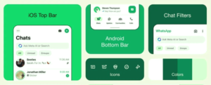
WhatsApp New Design has officially been unveiled, following a staged rollout that has already introduced a native bottom navigation bar on Android devices. Alongside this update, the app has undergone a visual refresh, with a new color palette selected after considering 35 different options.

The messaging platform has emphasized deeper tones in its color scheme to alleviate eye strain, particularly in low-light settings. As part of this initiative, the app’s dark mode has been adjusted to a darker shade, enhancing readability for message content.
For iOS users, sending photos and videos has been made more convenient with a revamped attachment layout. Instead of a full-screen menu, a new expandable tray now provides easier access to options when sharing media and documents.

Additionally, WhatsApp has updated its in-app icons with a more rounded, outlined style, and introduced a new default background for chats. These changes aim to enhance user experience and streamline messaging functionality across platforms.


